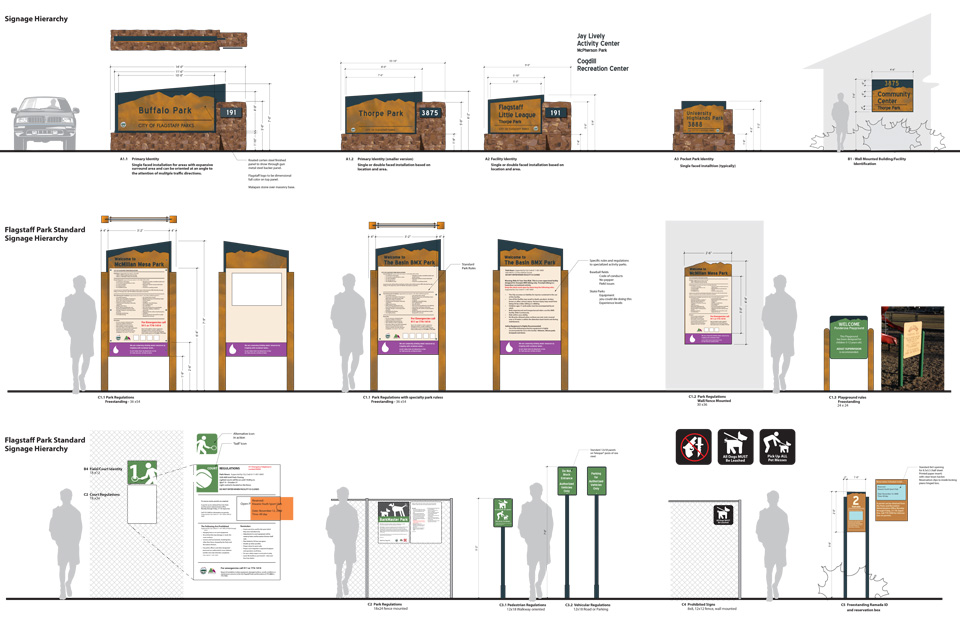
Planning a wayfinding signage system for a supermarket requires careful planning and customization to the market.
Introduction
In bustling supermarkets where a myriad of products are lined up across aisles and sections, the importance of a well-conceived wayfinding signage system cannot be overstated. Providing clear, visually-appealing, and easy-to-follow navigational cues, wayfinding signage plays a pivotal role in enhancing the shopping experience, increasing operational efficiency, and boosting sales. The objective of implementing an effective wayfinding system within a supermarket environment is to guide customers effortlessly to their desired destinations, making their shopping journey as intuitive as possible.
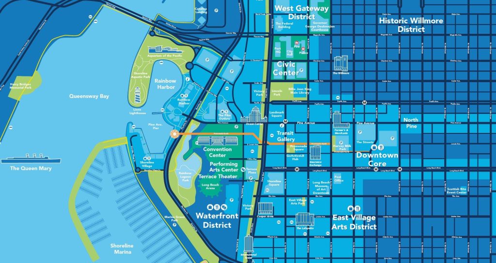
Shopping district ground map
Importance of Wayfinding Signage in Supermarkets
The importance of wayfinding signage in supermarkets cannot be understated. It serves a multifold purpose by increasing customer satisfaction, efficiency, and safety. Signage helps to streamline customer traffic through well-designed directions, minimizing congestion and maximizing the flow of customer movements. A well-thought-out wayfinding system can significantly reduce the frustration associated with trying to locate a hidden gem or everyday staple in a labyrinth of similar-looking aisles.
Moreover, signage is not just about guiding shoppers — it’s also a powerful tool for the supermarket to communicate with its customers. It creates opportunities for targeted messaging and branding, reinforcing the supermarket’s identity and promotional campaigns within the store environment. In essence, effective signage turns a maze into a map, transforming the shopping experience from a potential chore into a pleasant, efficient, and potentially educational stroll.
Objectives of the Wayfinding Signage System
The objectives of a wayfinding signage system within a supermarket are multifaceted. Primarily, the system aims to:
- Guide and Inform: To provide clear, concise directions to different sections and products within the supermarket. This not only includes helping customers locate items but also informing them about the availability of services, new products, and special offers.
- Enhance Shopping Experience: To reduce the cognitive load on customers by making navigation intuitive. This creates a more relaxed shopping environment where customers can focus on the products rather than worrying about finding their way around.
- Increase Efficiency: To expedite the shopping process by allowing customers to move through the store with ease and find what they need quickly. This efficiency can lead to higher customer throughput and potentially increase sales as satisfied customers are likely to return.
- Promote Safety: To ensure that in the case of emergencies, customers can promptly locate exits and staff can efficiently direct crowds, thereby maintaining order and safety.
- Foster Accessibility: To accommodate all customers, including those with disabilities, wayfinding should consider compliance with regulations such as the Americans with Disabilities Act (ADA) by providing visual, tactile, and auditory signage where necessary.
- Reflect Brand Identity: To incorporate the supermarket’s branding into the design of the signage system. This helps in creating a cohesive look that is instantly recognizable and resonates with the brand’s values.
Creating a wayfinding system that achieves these objectives is not just about putting up signs; it’s about thoughtful design, strategic placement, and ongoing management to ensure that as a supermarket evolves, its wayfinding system smartly navigates shoppers through change, leading to a mutually beneficial relationship between the store and its customers.
Understanding the Environment
A thorough layout analysis is essential for crafting an effective wayfinding system. This process involves scrutinizing the supermarket’s architecture, understanding traffic flow, recognizing key focal points where decisions are made, and identifying potential areas of confusion. It is crucial to consider how customers interact within the space: where they slow down, speed up, and what catches their attention. Accessibility regulations must also be considered to ensure that signage caters to all users, including those with disabilities.
To develop an effective wayfinding signage system that meets the unique needs of a supermarket, a deep comprehension of the store’s environment is vital. This involves an analysis of the layout, observation of how traffic flows naturally through space, understanding common consumer behavior patterns, and ensuring the setup is accessible and compliant with relevant regulations.
Layout Analysis of the Supermarket
Analyzing the layout of the supermarket is akin to reading a map before embarking on a journey. It involves understanding the physical structure of the store—where the entrances and exits are positioned, how the aisles are arranged, where each department is located, and how the checkout counters are accessed. Key to this is understanding the placement of high-demand products. These are often strategically located to draw customers through the store, encouraging exposure to a wider range of products. A good layout analysis also considers sightlines; customers should be able to see signage from different vantage points without obstructions. This meticulous study of the store’s blueprint helps in making informed decisions about where to place signage for maximum impact and utility.
Traffic Flow and Consumer Behavior Patterns
Understanding how customers move within the space—traffic flow—and why they move the way they do—consumer behavior patterns—is essential. Supermarkets typically see a variety of traffic patterns, from the quick in-and-out shopper to the leisurely browser. Observing these patterns can reveal natural pathways that customers take and can highlight potential bottleneck areas that could benefit from clearer signage. Behavior patterns offer insight into how customers interact with the environment—do they pause at promotional stands, do they backtrack when they miss an item, or do they follow a list methodically? By recognizing these patterns, the wayfinding system can be tailored to guide different types of shoppers effectively, whether it’s through prompting impulse buys or guiding efficient shoppers swiftly to their items.
Accessibility and Regulatory Compliance
Accessibility goes beyond basic accommodation—it’s about inclusivity and ensuring that every customer, regardless of ability, can navigate the supermarket with dignity and independence. This means considering a range of factors from sign height, font size, and color contrast to the inclusion of Braille or tactile signage for visually impaired customers. Auditory signals and announcements can also enhance accessibility. Compliance with regulatory requirements is more than a legal necessity; it demonstrates a commitment to all customers. Regulations such as the Americans with Disabilities Act (ADA) in the United States set standards for accessibility and are designed to protect the rights of all individuals. Ensuring that wayfinding signage adheres to such standards is a crucial step in both respecting the law and embracing the diverse needs of the store’s patrons.

ADA
In summary, understanding the environment is about taking a holistic view of the supermarket. It is about being attuned to the physical space and the people who navigate it, and ensuring everyone, regardless of their needs, can experience the supermarket in a way that feels natural and intuitive. This is where the true art of wayfinding emerges—not just in directing shoppers, but in understanding and responding to the dance of human movement within a retail symphony.
Design Principles for Wayfinding
Successful wayfinding systems are built upon four key design principles: clarity, consistency, simplicity, and intuitive language and iconography. Clarity pertains to making signs readable and understandable at a glance, which involves the use of large, bold typography and high-contrast color schemes. Consistency in design elements and placing ensures that once a customer understands the system, they can rely on it throughout the store. Simplicity means providing just enough information without overwhelming the shopper. Language and iconography should transcend cultural and language barriers whenever possible, making the system universally comprehensible.
An effective wayfinding signage system for supermarkets must be grounded on solid design principles to navigate customers smoothly and efficiently. These principles cater to a diverse array of shoppers, ensuring they can all have a positive experience within the store.
Clarity and Visibility
The hallmark of an exceptional wayfinding system is its clarity and visibility. Signage should eliminate confusion, not create more. This begins with high-contrast colors that stand out from the surroundings. Text should be legible, with a font size visible from a distance or from a shopper’s peripheral vision. The use of clear, concise language and unambiguous symbols adds to the effectiveness, ensuring signs can be understood quickly, from afar and by all, including those with visual impairments. Signs should be positioned at strategic points and heights that are visible across the store, ensuring both an approaching child and a tall adult can easily locate them.
Consistency and Branding
Consistent use of design elements such as color, typography, and imagery helps shoppers to become familiar with the signage system more quickly. When every sign in the supermarket feels like part of a cohesive family, customers are able to trust and rely on the system to navigate. For example, if directional signs are always blue, shoppers will instinctively follow the blue signs when looking for directions. Coupling consistency with the supermarket’s branding will reinforce brand identity throughout the shopper’s journey. Effective branding merges utility with emotion, encouraging a sense of place and a connection with the supermarket’s brand that extends beyond a single visit.
Simplicity and Intuitiveness
The most intuitive systems make complex spaces feel simple. Wayfinding should distill the challenge of navigating a sprawling supermarket down to its easiest form. This means avoiding overloading signs with information. Use symbols and pictograms that communicate directly and can be absorbed at a glance, and language that is brief yet descriptive. The ultimate goal is for a shopper to make the right decisions without conscious thought or requiring detailed study of the signage. Paths to important places like exits, restrooms, or customer service should feel almost obvious, guiding shoppers along with gentle suggestions rather than overwhelming directives.
Language and Iconography
The language and iconography used in wayfinding signage should bridge language barriers and cater to an international clientele. Icons especially can transcend language, delivering a universal message that is quickly recognized. When text is necessary, it should be presented in easily readable fonts and in the languages most common among the store’s clientele. For areas with diverse populations, multilingual signs can be a critical component of the system’s inclusiveness. The icons chosen should be internationally recognized—like the symbols for restrooms, elevators, or information—reducing the need for translation and facilitating a more welcoming and accessible environment for all shoppers.
In combination, these principles support a signage system that makes navigation within the supermarket seem effortless. Shoppers should feel that the store is easy to understand, decreasing their cognitive burden and allowing them to focus on the enjoyable aspects of their shopping experience. In essence, good design reflects thoughtful consideration of the user’s needs, and in the context of supermarket wayfinding, this is an avenue to customer satisfaction and business success.
Types of Wayfinding Signage for Supermarkets
Entrance signs set the initial tone and must provide an overview of the store layout. Aisle markers are essential for guiding customers through individual aisles, while departmental signage helps in locating broad sections like produce, dairy, or meat. Thematic signage can highlight specialty areas, and well-placed directional signs act as breadcrumbs leading customers between areas of interest. Informational signs can educate customers about products or special promotions.
Effective wayfinding in supermarkets requires various types of signage, each with a specific function, to guide and inform shoppers throughout their store journey. Below are some key types of wayfinding signage, which, when combined effectively, create an intuitive and comprehensive navigational system.
Entrance Signs
Entrance signs serve as the first point of interaction between the supermarket and the customer. They set the expectation and begin the navigational experience. These signs should be welcoming and clearly visible, offering an introduction to the store’s layout. They often provide a store directory or map that highlights the key departments or points of interest, such as customer service, restrooms, or specialty areas. An effective entrance sign prepares the shopper for a seamless shopping experience from the moment they step into the store.
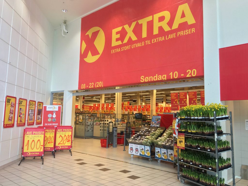
Entrance Signs
Aisle Markers
Aisle markers are critical in a supermarket as they offer immediate orientation within the rows of shelves. They should be placed at each aisle’s entrance and possibly along the length of the aisle for visibility. High-contrast numbers or letters allow customers to reference their location against a store directory or shopping list. These markers can be complemented with brief descriptions of the products contained within the aisle, such as ‘Canned Goods’, ‘Cereals’, or ‘Baking Supplies’, leading customers directly to the category of items they seek.
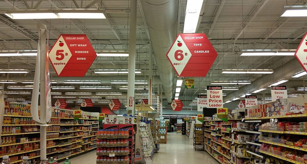
Aisle Markers
Departmental Signage
In larger supermarkets with distinct departments like produce, meat, bakery, or pharmacy, departmental signage provides clear, overarching markers for these areas. These signs are often suspended from the ceiling, larger in size, and use thematic imagery or color coding—like green for produce—which can assist in quick visual identification. Departmental signage is particularly useful in creating a mental map of the store for customers, facilitating a more strategic shopping approach.
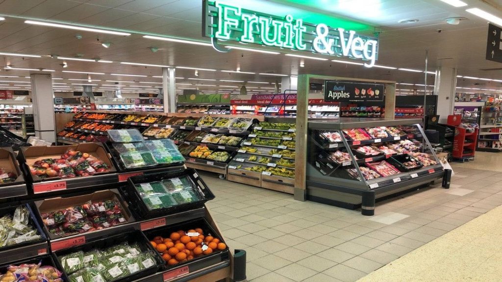
Departmental Signage
Thematic Signage (e.g., Organic, Gluten-Free, Sale Items)
Thematic signage highlights specialized segments of product offerings, catering to customers with specific needs or preferences. For example, an ‘Organic’ section sign guides those looking for organic produce, while a ‘Gluten-Free’ sign assists those with dietary restrictions. Signage for sale or promotional items helps shoppers spot deals and discounts, which can be a significant draw. Thematic signs should stand out from regular aisle and departmental signage, using unique icons, colors, or lighting to draw attention.

Sale Items Signage
Directional and Navigational Signs
Directional and navigational signs show the route to service areas, exits, restrooms, and other critical spots like the customer service desk or checkouts. These signs are typically consistent in their design language, employing arrows and succinct text to lead the way. Positioning is strategic, often at decision points where customers need to change direction. Directional signs are the guiding hand of the store, ensuring shoppers can find their way with confidence.
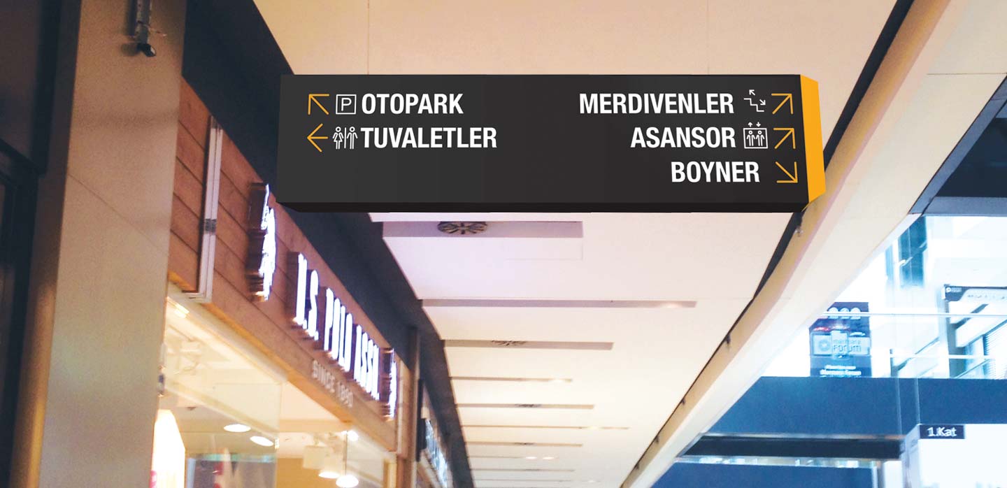
Directional and Navigational Signs
Informational and Educational Signs
Informational and educational signs serve to enhance the shopping experience by providing additional details about products or how to navigate the store. They can include tips for choosing fresh produce, information about sustainability practices, or instructions for recycling within the store. These signs tend to be more textual and may be placed near relevant products or in waiting areas, like the deli ticket queue, where customers have more time to read. Educational signage can add value to the customer’s visit, imparting knowledge and potentially fostering loyalty as the store is seen as a source of helpful information, not just goods.
By combining these varied types of signage into a harmonious wayfinding system, a supermarket makes every effort to ensure that shopping is not a chore but rather a pleasant, efficient, and informative experience for every customer.
Technology Integration
Integrating technology such as digital signs, interactive kiosks, and mobile applications can vastly enhance the wayfinding experience. Customers could receive turn-by-turn navigation from their smartphone, matched to personalized shopping lists. Smart cart technology could guide consumers through the most efficient path to complete their shopping based on their list items.
Integrating technology into wayfinding signage systems in supermarkets not only modernizes the shopper’s experience but also offers dynamic and interactive options for navigating the store. Below are some technological innovations that can be integrated into wayfinding systems:
Digital Signage and Interactive Kiosks
Digital signage is a versatile tool in wayfinding. It can be updated in real-time to highlight sales, special events, or changes in the store layout. These bright, engaging displays can show rotating messages, which allows for more content in a limited space. Interactive kiosks take this a step further by allowing customers to input information and receive personalized directions. For example, a shopper could search for a specific product and receive a printed map or on-screen directions showing the quickest route from their current location. These kiosks can also double as information points, offering store announcements, promotional videos, or even serving as a platform for customer feedback.
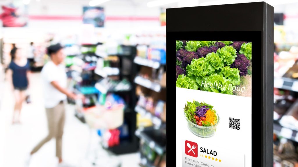
Digital Signage
Mobile App Integration for Personalized Guidance
Mobile applications can provide a high degree of personalized guidance for shoppers. For instance, supermarkets can develop apps that allow customers to create shopping lists before they arrive. Upon entering the store, the app can suggest an optimized route based on the shopper’s list and the store’s current layout. Push notifications can alert customers to deals or promotions on products they frequently purchase or suggest new items based on their shopping history. Bluetooth beacons within the store can interact with the app to help pinpoint the shopper’s location, offering step-by-step navigation directly on their mobile device.
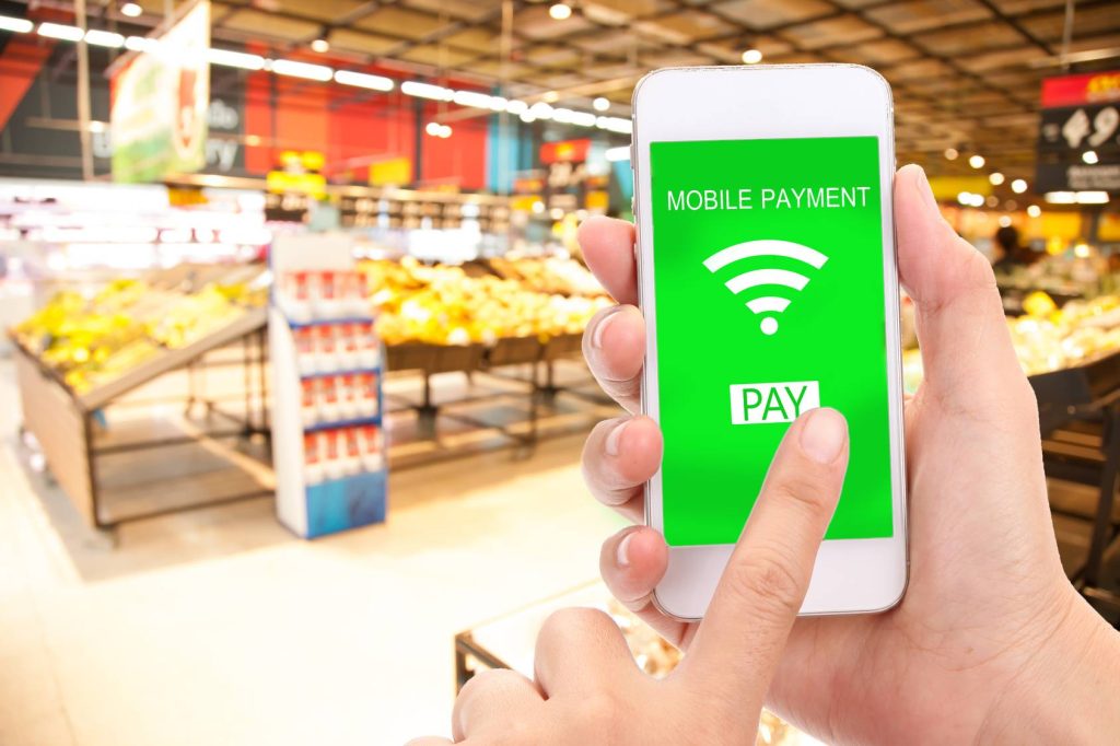
Mobile Payment
Smart Cart Integration
Smart cart technology represents the cutting-edge intersection of physical shopping and digital assistance. These carts can be equipped with touchscreen interfaces that sync with a store’s wayfinding system. Shoppers can dock their smartphones or use the interface directly to access a store map or upload a shopping list. As the shopper makes their way through the store, the smart cart can guide them along the most efficient path, provide alerts about products on deal that align with the items in the cart, and even facilitate a rapid checkout process. Some smart carts may also use sensors to prevent theft or inadvertent exits with unpaid items.
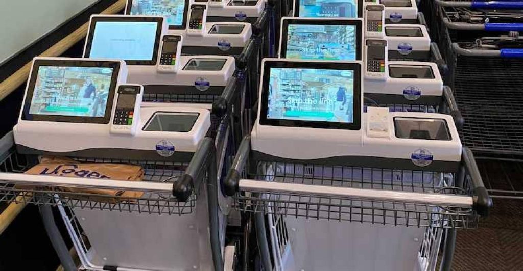
Smart Cart
Through the integration of these technologies, supermarkets can create a more interactive and seamless shopping experience. These innovations hold the promise of not only streamlining the route to purchase but also adding layers of engagement and personalization that can foster customer loyalty and potentially transform shopping from a mundane task into a highly efficient, enjoyable experience.
Implementation Strategy
Successful deployment of a wayfinding system requires careful planning and prioritization. The signage strategy should be tailored to the specific needs and size of the supermarket. Collaboration with design professionals can ensure that the system is both functional and visually appealing while sticking to budget constraints.
Deploying an effective wayfinding system is not an overnight task; it requires careful planning and execution. Here are several strategic points that should be considered:
Prioritization and Phasing
Implementing a new wayfinding system should be approached in a logical and manageable manner. It is wise to prioritize areas that will have the most immediate impact on customer experience and sales. This often begins with entrance signs and aisle markers, as they are crucial for first impressions and general navigation. Once these primary components are in place and operational, subsequent phases can focus on departmental, thematic, and promotional signage. In addition to rolling out signage, this approach also allows for testing and feedback on each phase, ensuring that subsequent rollouts are informed by real-world use.
Customization to Supermarket Size and Variety
A wayfinding system should be customized to the size and variety of products offered in the supermarket. Larger stores with multiple departments must ensure that their signage offers more detailed guidance to avoid overwhelming customers with too many options. Conversely, smaller stores might opt for simpler signage that promotes an easy and quick shopping experience. An intelligent wayfinding strategy acknowledges the store’s footprint and assortment complexity, adapting signage scale and detail accordingly.
Collaborating with Design and Signage Professionals
Collaboration with experienced design and signage professionals can significantly benefit the development and implementation of a wayfinding system. These professionals will be well-versed in the principles of visual design, ergonomics, and customer behavior, all of which are crucial to creating an effective wayfinding solution. They can provide insights on the latest trends, materials, and technologies, ensuring that the supermarket’s wayfinding system is not only functional but also aesthetically pleasing and engaging for customers.
Budgeting and Cost-Effectiveness
A well-crafted wayfinding system should meet the supermarket’s needs without exceeding budgetary constraints. Budget planning needs to factor in the design, production, and installation costs of the wayfinding signs, as well as ongoing maintenance and eventual updates or replacements. Cost-effectiveness does not necessarily mean choosing the cheapest options but rather investing in quality materials and designs that will stand the test of time and provide a good return on investment through improved customer satisfaction and loyalty. Additional budget considerations may include the integration of technology solutions, which, while potentially more expensive upfront, can offer long-term savings and increased efficiency.
The implementation of a wayfinding system should be a strategic investment that enhances the overall shopping experience, directs traffic flow efficiently, and ultimately drives sales. It requires foresight, adaptability, and a relentless focus on the customer experience to truly benefit both the supermarket and its clientele.
Maintenance and Updates
The best wayfinding systems are designed for durability but accommodate flexibility for future changes. Regular evaluations can ensure that the signs are effective and up-to-date, while customer feedback can drive continuous improvement.
Once a wayfinding system is in place, it requires ongoing maintenance and periodic updates to remain effective and relevant. Here are the key considerations in this ongoing process:
Durability and Sustainability of Materials
The choice of materials for signage has a direct impact on their longevity and appearance over time. High-traffic supermarkets, in particular, need wayfinding signs made from durable materials that can withstand frequent cleaning, exposure to sunlight, and the wear and tear of shopping carts and consumer interaction. These materials should be easy to maintain and hold up well under constant use. Along with durability, there’s an increasing emphasis on the sustainability of materials. Environmentally-friendly options such as LED lighting for digital signs, recycled plastics, and sustainably sourced wood products not only adhere to green standards but also appeal to eco-conscious consumers.
Schedule for Regular Evaluation and Updating
To ensure that the wayfinding signage remains accurate and effective, a regular evaluation schedule should be established. This may involve periodic walk-throughs to check for signs that are damaged, have outdated information, or are no longer positioned optimally due to changes in store layout or product locations. Regular evaluations should also consider whether the signage still adheres to best practices in visibility and legibility, potentially leading to updates that reflect the latest design innovations. Furthermore, as store offerings evolve—such as the introduction of new product lines or services—updates to the wayfinding system will be necessary to direct shoppers to these areas.
Customer Feedback and Adaptation
Customer feedback is an invaluable tool for refining a wayfinding system. Regularly soliciting feedback—through surveys, direct observation, or digital platforms—can provide insights into how shoppers interact with the signage and where they encounter difficulties. Shoppers are the end-users of the wayfinding signs, and their experiences can highlight unforeseen issues or areas for enhancement. Acting on this feedback and adapting the wayfinding system as needed demonstrates a supermarket’s commitment to customer service and can lead to a more intuitive shopping experience. This ongoing loop of feedback and adaptation keeps the system responsive to the needs of the customers and aligned with the supermarket’s operational goals.
In implementing these strategies, a supermarket ensures that its wayfinding system continues to serve as an effective navigation aid, combining practical maintenance with responsive updates to remain a reliable and welcomed feature of the shopping experience. This proactive approach to maintenance and adaptation not only sustains the investment in the wayfinding system but also reinforces a positive image of the supermarket in the minds of the customers.
Conclusion
This brief introduction gives a glimpse into the intricacies involved in planning a supermarket wayfinding signage system. A complete article would delve into each section in detail, providing a comprehensive guide to supermarket owners and managers looking to enhance their in-store navigation systems.
The effectiveness of a wayfinding signage system in a supermarket setting is measured by how seamlessly it guides and informs customers, enhances their shopping experience, and conveys the store’s branding and promotions. To conclude, let’s succinctly recapitulate the key points, discuss the importance of embracing continuous improvement, and speculate on emerging trends in wayfinding technology.
Recapitulation of Key Points
To begin, the foundation of any exceptional wayfinding system is hinged on meticulous planning that involves a deep understanding of the store layout and customer behavior, incorporating principles such as clarity, consistency, simplicity, and the wide comprehension of language and iconography. Further, a myriad of sign types—ranging from entry welcoming signs and aisle indicators to departmental identifications and thematic displays—are all designed to harmoniously guide customers while reflecting the store’s brand. The integration of technology, like digital signage, mobile wayfinding apps, and smart carts, represents a significant enhancement in the interaction between the store and consumer, offering personalized and interactive navigation. The wayfinding system rollout must be methodically planned, phased, and customized to align with the supermarket’s scale and shopper variety, with prudent budgeting for long-term sustainability. Lastly, maintaining the system’s relevance and effectiveness requires enduring dedication to its sustenance through regular evaluations, hearty acknowledgment of customer feedback, and timely updates.
Encouraging Continuous Improvement
Continuous improvement in wayfinding is essential to address the dynamic nature of consumer needs and supermarket offerings. Supermarkets must prioritise customer satisfaction, harnessing feedback loops and drawing insights from everyday interactions within the store to refine the wayfinding experience continually. This cyclical process ensures that the wayfinding signage resonates with changing consumer behaviors, store layouts, and the supermarket’s brand image.
Future Trends in Wayfinding Technology
Looking ahead, future trends in wayfinding are likely to leverage advances in technology to offer even more sophisticated and customer-friendly navigation tools. We can anticipate the rise of augmented reality (AR) applications that overlay digital information onto the real-world store environment enhancing the realism of directional guidance. The use of big data and analytics may further personalize the shopping experience by adapting wayfinding cues to shopping habits and preferences. Additionally, the integration of geofencing could allow for location-based promotions and assistance the moment a customer approaches a particular product or aisle. These advancements promise a future where wayfinding in supermarkets becomes a seamless, almost invisible conductor of customer flow, delivering a shopping experience that is informative, effortless, and customized.
In summary, the deployment of an efficiently designed wayfinding system is a testament to a supermarket’s commitment to customer orientation. It is a strategic investment fostering an intuitive, pleasurable shopping journey that encourages repeat visits. With smart adoption and integration of evolving technologies, supermarkets can also look forward to providing an even more cutting-edge, user-friendly shopping environment that resonates well with the tech-savvy consumer of tomorrow.
