Last October, Administrative Pastor Ben Overton approached my shop, Synergy Signs & Graphics, LLC in Strasburg, Ohio, with an exciting opportunity—to design an eye-catching sign that would coincide with his Burning River Church’s rebrand. The church felt that, with a new name and logo, this new sign would serve as the centerpiece of their rebrand campaign.
This article will explore the journey of how my shop collaborated with the church to create and install what I feel to be a pretty remarkable sign. After a productive initial meeting with the church, my shop embarked on the design process. We ended up presenting three options to the church. The chosen design—a industrial-looking vertical pylon with a steel surround and rusted background—impressed the church members.
Following some minor design revisions, we received the green light to proceed with production. However, the church is located in Dover, Ohio’s downtown historic district, which meant that we were going to have to comply with additional requirements.
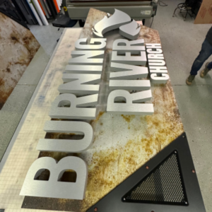
The letters were routed out of thirty-pound-density Precision Board.
First we had to pass through the architectural review board overseeing aesthetics in the district. Once they approved the design, we then had to apply for a variance from the city council—since the new sign was going to exceed the height limit set by the historic district’s sign code.
Fortunately the variance was granted for this project, and our fabrication process commenced in December 2022.
We built the sign’s sturdy frame using 2-by-12-inch steel tubes welded to a 3/8-inch steel plate base. This base was secured on-site to a raised concrete foundation with embedded anchor bolts. Adding to the industrial aesthetic, we welded seventy steel hot rivets to the outer face of the frame.

The process of fabricating and painting the steel frame involved several meticulous steps.
We initiated by sanding, thoroughly cleaning, and then applying three layers of automotive-grade epoxy metal primer to the entire structure. To achieve the desired aesthetic, we then expertly applied a custom-mixed Nova® Color acrylic metallic dark gray paint using our 3M™ Accuspray™ HVLP paint system. As a final touch, we hand-painted bronze accents on the rivets, elevating the visual impact of the frame.
Our shop also took great care in crafting the “Burning River Church” channel letters for the sign. These letters were meticulously carved from two-inch-thick thirty-pound-density Precision Board® high-density urethane (HDU) sourced from Coastal Enterprises. We paid special attention to creating integral mounts on the backs of the letters, which would serve as receptacles for the MBS stand-offs used to securely attach the letters to the sign faces.
Furthermore, we carefully pocketed out the letters to accommodate a total of 150 Hanley LED Peregrine Series RGB modules. This innovative design allowed for mesmerizing color-changing halo lighting, creating a captivating visual spectacle during nighttime hours. To protect and enhance this effect, we applied 3/16-inch polycarbonate lenses to the back of each letter.

The process of populating and attaching the HanleyLED Peregrine Series RGB modules to the insides of the routed letters was carried out with meticulous precision.
We utilized our Multicam 3000 Series router, equipped with X-Edge router bits, which ensured precise drilling for all the mounting holes and electrical supply points. This made the final assembly a seamless and efficient process.
The original design had called for rusted steel backgrounds, but we aimed for a more controlled approach to achieve the desired aesthetics. In order to maintain a balance between achieving the look we envisioned and having control over color and rust effects, we decided to use faux-finished AlumaCore faces. This involved applying six coats of Nova Color paints and glazes, allowing us to create an authentic rusted appearance. This decision not only ensured that the sign’s visual appeal aligned perfectly with Burning River Church’s vision but also guaranteed long-lasting durability.
The combination of the sign’s vertical pylon design, steel frame adorned with rivets, and the faux-rusted AlumaCore faces culminated in a visually striking and impactful statement.
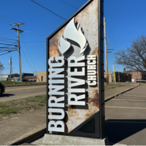
The sign frame was securely anchored to a raised concrete foundation using embedded anchor bolts, ensuring its stability and long-term durability.
The collaboration between our team and Burning River Church has culminated in the creation of a truly remarkable sign. Every stage of the process, from the initial design to the precise fabrication and installation, was executed with meticulous attention to detail. Serving as the centerpiece of Burning River Church’s rebranding campaign, this new pylon sign featuring their fresh name and logo has undeniably succeeded in capturing attention, making a lasting impression on both the church’s members and the local community.
Seven months have now passed since the sign’s installation, and the response has been overwhelmingly positive. We’ve received an abundance of comments and calls from individuals expressing their admiration for the sign’s captivating design.
This monument/pylon sign stands as a symbol of the church’s rebranding triumph and their dedication to not only figuratively but also literally capturing the attention of their community.
For a visual representation of the project, please browse through the gallery below to view all the pictures.
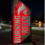 The industrial-inspired pylon sign features a steel frame with rivets and LED-backlit letters.
 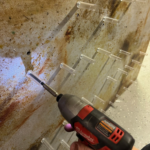 Installing the MBS stand-offs.
  The sign frame was secured to a raised concrete foundation with embedded anchor bolts.
 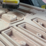 CNC-routing the letters
  Populating and attaching the HanleyLED Peregrine Series RGB modules to the insides of the routed letters.
 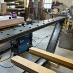 Fabricating and painting the steel frame
 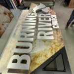 The letters were routed out of thirty-pound-density Precision Board.


